In Power BI, Map and Filled Map visuals are used to represent geographical data on a map. It can help you analyze and communicate geographical data and provide valuable insights that may be difficult to glean from other types of charts and graphs.

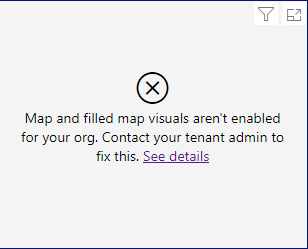
In this post, we will learn What’re Map and Filled Map visuals in Power BI? and How we can enable the Map and Filled map in Power BI Admin Portal to can use it in our report without getting this error “Map and Filled Map aren’t Enabled for your Org. Contact your tenant admin to fix this“.
Map Visuals Type in Power BI
There are two types of maps available in Power BI:
- Regular maps and
- Filled maps.
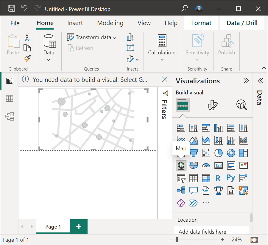
1) Map Visual in Power BI
A regular map in Power BI shows the data points on a map as points or bubbles, with each data point representing a location on the map.
Regular maps are useful when you have data points that are not related to each other or if you want to show the location of a particular data point.
2) Filled Map in Power BI
A filled map in Power BI is a map visual that shows the data as shaded areas, with each area representing a geographical region or location.
Filled maps are useful when you want to display data by region, such as sales data by state or population data by country.
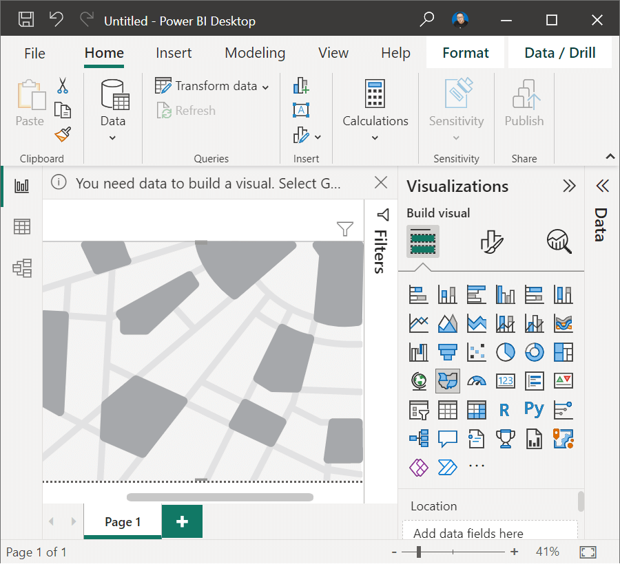
When creating a filled map in Power BI, you need to have a field in your dataset that contains the geographic information, such as country, state, or city. Power BI will use this field to map your data to the appropriate geographic region. You can also customize the colors used to represent different data values, as well as add labels and tooltips to provide more information about the data.
Why you need to use Map visuals in Power BI?
Here are some reasons why you might need a map in Power BI:
- Geographic Analysis: If your data is related to specific locations or regions, a map can help you quickly identify patterns and trends. For example, you can use a map to visualize sales data by region, or to identify areas where your product is most popular.
- Contextualization: Maps can provide context to your data. For example, if you’re analyzing data related to a particular country, a map can help you see how different regions within that country are performing.
- Interactivity: Maps in Power BI are interactive, allowing you to zoom in and out, and to click on different regions to view more detailed data.
- Communication: Maps can be a powerful tool for communicating data to others. They can be easily understood by people who may not be familiar with complex data visualizations or charts.
Solving: Map and Filled Map aren’t Enabled for your Org
In Power BI service, if you tried to add a Map or Filled Map visual in your report for the first time, you may get the below error:
“Map and Filled Map aren’t Enabled for your Org. Contact your tenant admin to fix this“.

Map and Filled map visuals are disabled

To fix this, ask your tenant admin to enable map and filled map visuals in the admin portal.
Please, Try again later or contact support, if you contact support please provide these details
Actually, this error occurs in case the enable Map and Filled Map visuals is disabled in your tenant settings in Power BI Admin Portal.
How to Enable Map and Filled map visuals in Power BI Service?
To Enable Map and Filled map visuals in Power BI service, you have to do the following:
Steps
- As a Power BI Tenant Admin, open https://app.powerbi.com/
- Provide your email, then provide the password.
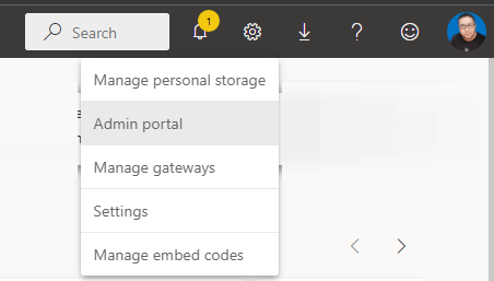
- Click on the setting gear icon and select
Admin Portal.
- From the left navigation menu, click on “Tenant Settings“.
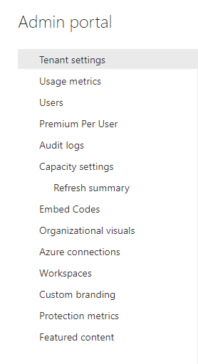
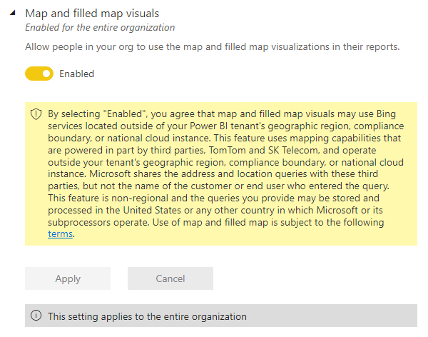
- Scroll down to Map and Filled Map Visual Settings.
- Click
Enableto allow people in your org to use the map and filled map visualizations in their reports. - Then click on Apply.
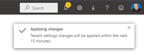
- Once you click apply, The setting will be applied to the entire organization, and the Tenant settings changes will be applied within the next 15 minutes and may take more than this period.
Conclusion
In summary, maps in Power BI can help you analyze and communicate geographical data, and provide valuable insights that may be difficult to glean from other types of charts and graphs.
In this post, we have learned How to Enable Map and filled map visuals in Power BI to avoid this error “Map and Filled Map aren’t Enabled for your Org. Contact your tenant admin to fix this“.
