This post will teach you how to display data by date in a timeline fashion using a custom Power BI Timeline Visual, as demonstrated below.
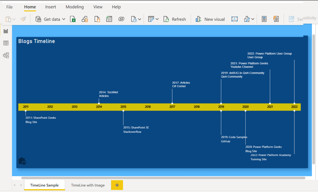
Timeline Visual in Power BI
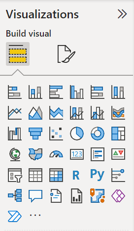
You can only find the 37 common default visualizations that are available by default in Power BI’s Visualizations Pane, as seen below.
However, you can acquire more custom Power BI visuals from AppSource that you could use in your report to meet your needs.
App Source is App Store helps you to find the right app for your bussiness needs, it’s not only for Power BI, however, you can use with many products like Microsoft 365 and Power Platform …etc.
You can browse all App Source at Microsoft App Source
In the App Source, you can find the “Timeline by Queryon” which is one of the fantastic free visuals that may help you exhibit your data by date as a timeline.
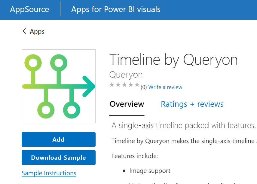
Timeline Visual in Power BI
Timeline by Queryon is a single-axis timeline packed with many features, such as:
Power BI Timeline Visual Features
- Show an image for each entry in the timeline.
- There are various timeline formats such as line, bar, waterfall, and kanban-style layouts.
- Clickable links for reference items
- Downloadable iCalendar (ICS) file that integrates with Outlook.
- Flexible format.
- Supports time series data sets without date restrictions.
- Custom format for each item.
- Show text on top or on the bottom.
Power BI Timeline Visual Limitations
- Only a horizontal timeline is supported, no vertical timeline.
- There are difficulties in repositioning and resizing the visual, and it’s considered a known issue for most custom visuals.
- Images must be stored in Base64 format.
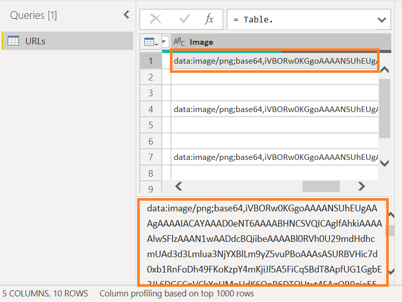
You can convert your image to Base64 fromat online by using this site https://www.base64-image.de/
When should you use the Timeline visual in Power BI?
You can use the Power BI Timeline visual in the following cases:
- Employment history
- Visualize project milestones or stage gates.
- Visualize key events
- Race finish times
- Showing upcoming events for a company
- Showing upcoming holidays, birthdays, or events with a picture.
How do you use the Power BI Timeline Visual?
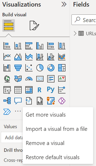
As we earlier mentioned, the Power BI desktop’s visualization pane does not include the Timeline visual by default; instead, you must add it from App Source by doing the following steps:
- In the Visualization Pane, Click on the eclipse three points to get more visuals.

- In the App Source search box, search for Timeline “Timeline by Queryon”.
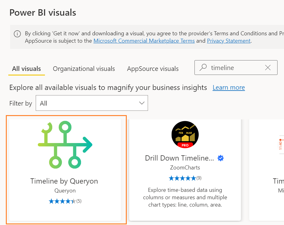
- Click on the first result that matches your search query, then click on the “Add” button as shown below.

- You will get the message below after clicking the “Add” button, informing you that the visual has been successfully imported into this report.

- Go back to the Visualization Pane, you will notice that the new visual has been added successfully as shown below.
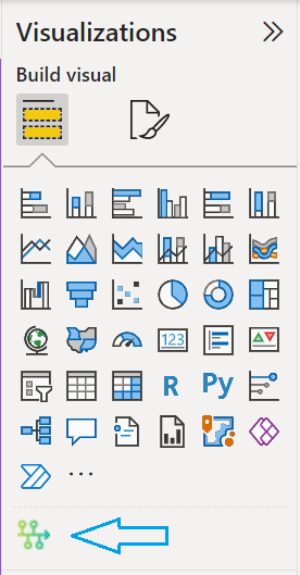
- Click on the added visual to add it to your canvas page.
- Now, you have to configure the visual fields to can show your data as a timeline.
- Title: The label that would be shown in your timeline.
- Date: This should be a valid date field with a date hierarchy to can show the Year or the full date as you need.
- Optional URL: This is an optional field that would help you to make your title clickable, and if this field is not assigned, you can use the clickable title for filtering purposes.
- Optional Image: It’s a Base64 image field that you can use to show an image per entry in your timeline visual.
- Optional Description: This is additional data shown below the title and it’s optional to set as per your need.
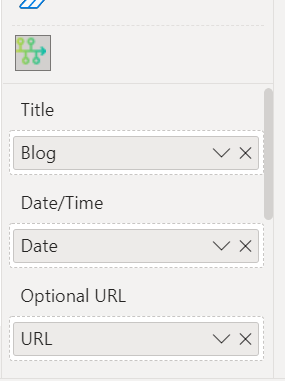
- After setting the required and optional fields, you have now to format your Power BI Timeline visual as you prefer.
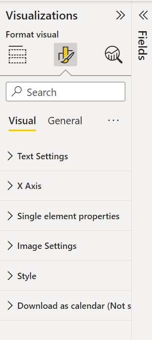
You can download a sample for Power BI timeline visual from GitHub to learn more about the timeline visual formatting.
Horizontal Timeline Visualization without Image
The result of the horizontal timeline visualization without an image is shown below.

Horizontal Timeline Visualization with Image
Below is the output of the Horizontal Timeline Visualization with Image.
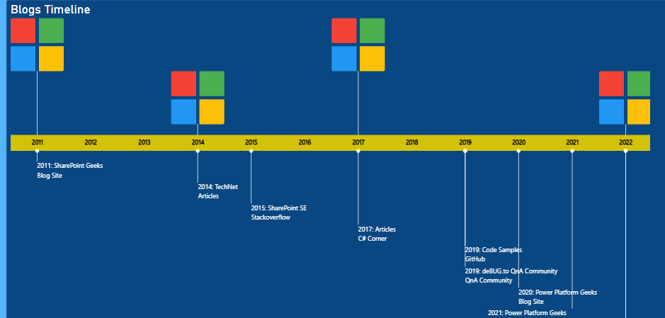
You can download a sample for Power BI timeline visual from GitHub to learn more about the timeline visual formatting.
Conclusion
Although there isn’t a visual in the Power BI Visualization Pane to display your data in a chronological format, you can utilize the App Source to add a customized Power BI timeline visual to accomplish your objective.
In this post, we looked at the features and restrictions of Power BI’s Timeline visual as well as how to use it.
Download
Download a Power BI Timeline Visual Sample PBIX file from our Power BI GitHub Repo.
See Also
- How to show Zero values in Power BI Chart?
- Power BI Vertical Timeline Visual
- If you have any related questions please don’t hesitate to ask them at deBUG.to community.
