A Gantt chart is a type of bar chart that is commonly used in project management to visualize the schedule of tasks or activities over time.
A Gantt chart in Power BI is a type of visual that can be created using data from a project management or scheduling tool, such as Microsoft Project.

In this post, we will explore Gantt Visual in Power BI capabilities and How to use Gantt Chart in your Power BI report to provide a clear and intuitive way to visualize project schedules and track progress over time.
What’s Gantt chart in Power BI?
As we earlier mentioned, A Gantt chart is a type of bar chart that is commonly used in project management to visualize the schedule of tasks or activities over time.
A Gantt chart in Power BI displays the start and end dates of each task or activity as horizontal bars along a timeline, with each bar representing a different task. The length of the bar corresponds to the duration of the task, and the bars are color-coded to indicate the status of each task (e.g., completed, in progress, not started).
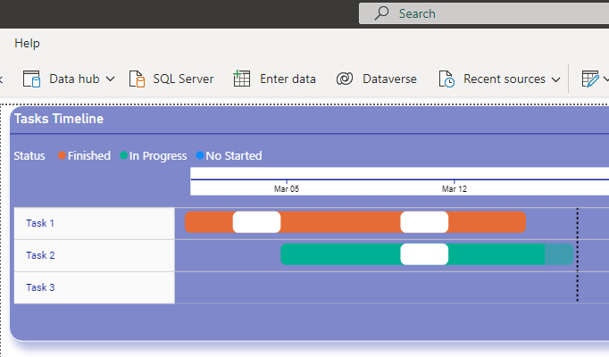
Users can also add dependencies between tasks, which are represented by arrows connecting the bars. This allows users to see how changes to one task may impact the overall schedule and help identify potential scheduling conflicts or delays.
How to use Gantt chart in Power BI?
In Power BI Desktop, the Gantt chart visual is NOT listed in the visualization pane by default.
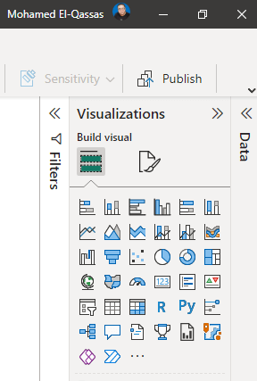
However, you can import it from AppSource by doing the following:
Import Visual in Power BI
- In the Visualization pane, Click on the three-dot “…” to add a new visual.
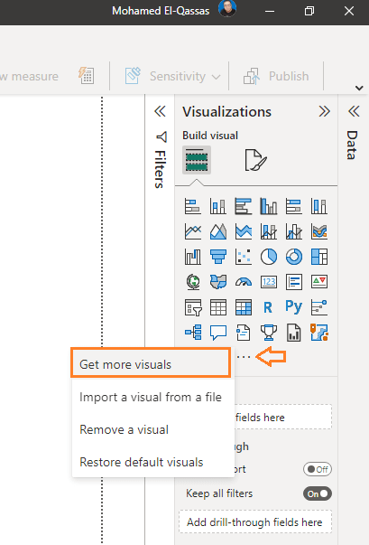
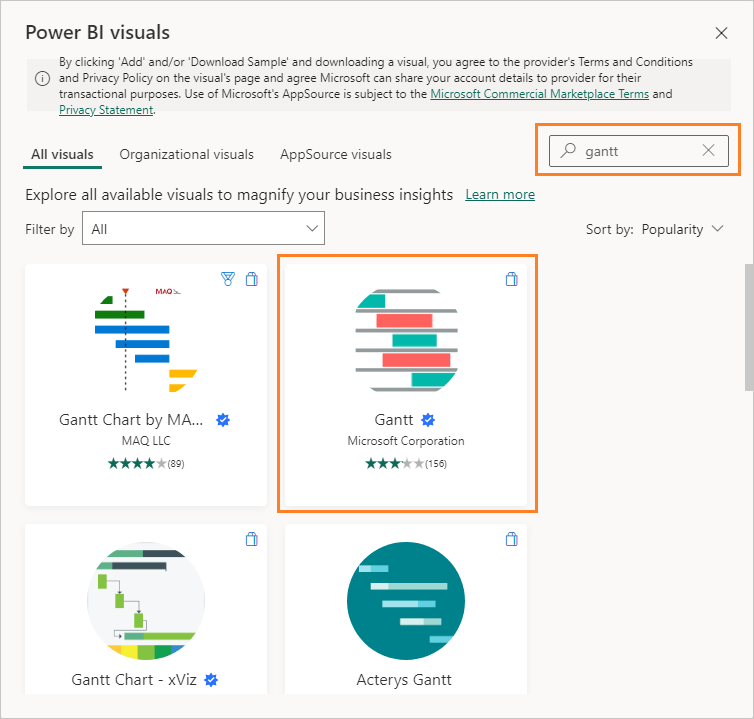
- In “Power BI visuals“, search for “Gantt” to explore all available visuals in your organization or from AppSource.
- As you can see, you will find many Gantt visuals with different features available from Microsoft and other partners sorted by default by “Popularity“.
- In our case, we will use the Gantt visual from Microsoft to get support and ensure stability, moreover, it’s a free visual that doesn’t need any fees.
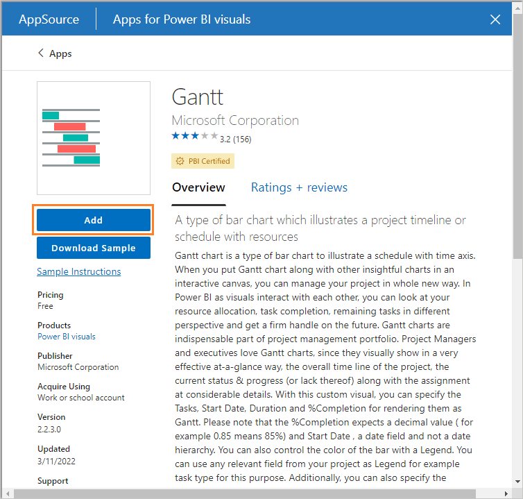
- Once you click on Gantt visual as shown above, you will get features and details about the visual, click on the “Add” button to add it to your Visualization pane to use it in your report.
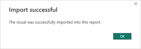
- Great, a new Gantt visual has been imported successfully.
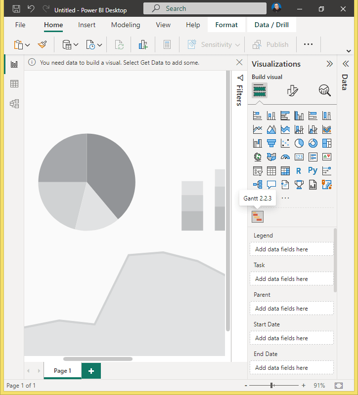
- And the Gantt chart visual is now listed in the visualization pane.
Configure Gantt Chart in Power BI
To configure Gantt Chart in Power BI, you have to do the below steps:
- Explore Gantt Chart Fields
- Prepare Data,
- Set Gantt chart Fields,
- Set Gantt chart format settings.
Explore Gantt Chart Fields
The Gantt Chart in Power BI has the below fields
- Legend (can be used for status field)
- Task* (used for Task or Project name)
- Parent (if there are dependencies)
- Start Date* (Task Start Date)
- End Date* (Task End Date)
- Duration (can be used instead of the end date)
- %Complete (the percent of completion for your task or project)
- Resource (Assigned Resource)
Prepare Data for Gantt Chart Fields
After exploring the Gantt chart fields, your dataset should have the below fields to show your data in Gantt Chart in Power BI
- Task* (used for Task or Project name)
- Start Date* (Task Start Date)
- End Date* (Task End Date) or Duration (can be used instead of the end date)
Other fields will be shown as tool tips or inside the taskbar such as Resource, and %Complete.
In our case, we have added most of the required fields to can present the full capabilities of the Gantt Chart in Power BI

You can download the PBIX file from Github Power BI Samples
Set Gantt chart Fields
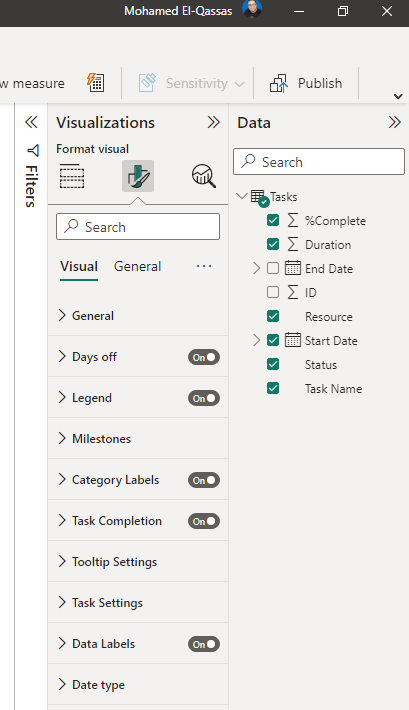
Now, the data is ready, and you just need to drag the Gantt visual to your report, to set Gantt chart Fields as below.

Just drag the fields from the “Data” Pane to the corresponding fields of the Gantt chart in the “Visualization” Pane.
Set Gantt chart format settings
The last step, to get your Gantt chart ready is to configure the format settings as you prefer.
Days off
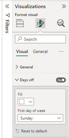
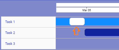
By default, the days off is disabled, and you can use this section to specify the week start date and the color of Days off in your taskbar.
Output
Legend
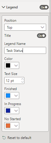
By default Legend is enabled and shown on the right side, however, you can configure it as you prefer based on the below settings.
Output

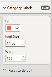
Category Label
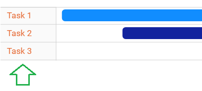
By default, the category label is enabled and used to customize the Task field width, font size, and color.
Output
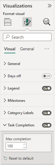
Task Completion
By default, Task completion is enabled. however, you have to set the Max Completion to can highlight the actual percentage complete.
Output

Once you finish the formatting part, you the final look and feel for the Gantt chart should look like the one below.

You can also download the PBIX file from Github Power BI Samples
Conclusion
In conclusion, a Gantt chart in Power BI is a powerful visual tool for project management and scheduling. It allows users to easily track progress, visualize task dependencies, and identify potential scheduling conflicts or delays. The chart displays task information such as start and end dates, duration, and status using horizontal bars along a timeline. Users can customize the chart with color-coded bars and add dependencies between tasks. Overall, a Gantt chart in Power BI is an essential tool for any project manager or team looking to effectively manage and track their project schedules.
Download
You can download the PBIX file with a real example from Power BI repo on GitHub
