In this blog post, we will learn how to use PowerApps Container? and how to make :
- PowerApps container responsive design
- PowerApps container auto height
- PowerApps container responsive
- PowerApps container vs vertical container
- PowerApps container control
- PowerApps container scrollable
- PowerApps container wrap
- PowerApps container flexible width
- PowerApps container background image
- 1 What is container in PowerApps?
- 2 Remove PowerApps container control
- 3 What is the difference between group and container in PowerApps?
- 4 PowerApps nested Containers
- 5 Vertical and Horizontal Containers Properties
- 6 PowerApps container flexible Height
- 7 PowerApps container control hide
- 8 PowerApps container control auto height
- 9 PowerApps container control background image.
- 10 PowerApps add existing controls to container
- 11 How to make the PowerApp responsive using containers?
What is container in PowerApps?
- A container in PowerApps is a type of control that can hold a set of controls like labels, textboxes, combo, galleries, buttons, and so on.
- You can add a blank container on your Power Apps screen and begin to customize and design it by adding controls to it.
- Or you can start with a number of controls, just select them and add using tree view.
- Containers make it easier to design an app’s layout. When you placed a control within a container, it is automatically positioned.
- You can use Container to create PowerApps responsive layouts.
- What’s really cool is that we can stack multiple Containers within each other.
Power Apps Container Limitation
- Containers don’t work within forms , but you can add forms inside the container.
- The following controls are not supported within a container:
Power Apps Container controls types
In Power Apps you will find three types of containers that you can use inside your app.
- Container: by using this PowerApps container type you can allow the controls to be positioned on top of one another.
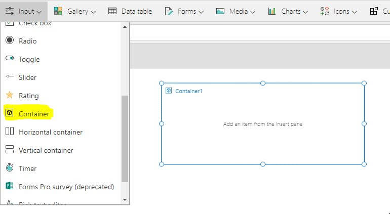
- To add the PowerApps container control : Insert tab > Input > Select Container.
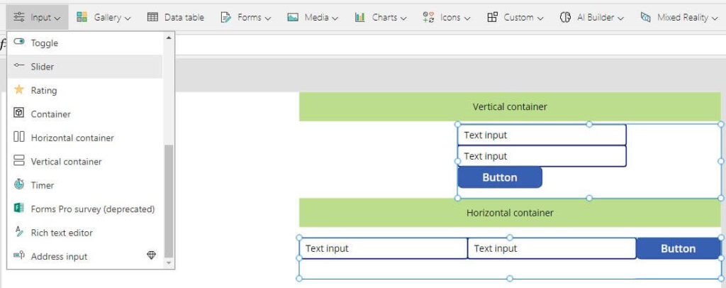
- Vertical Container: all the controls will display with the Vertical layout it stacks controls up-and-down.
- Horizontal Container: all the controls will display with the Horizontal layout it positions the controls side by side beginning from left to right.
a container can change its direction at any time, so a horizontal container can become a vertical container and vice versa.
PowerApps container control Properties
- BorderColor : The color of a control’s border.
- BorderStyle: this property is to specify whether a control’s border is Solid, Dashed, Dotted, or None.
- BorderThickness: specify the thickness of a control’s border.
- Fill : The background color of a control.
- Height : is the distance between the top and bottom edges of a control.
- Width: The distance between the left and right edges of a control.
- Visible: this property is to specify whether a control appears or is hidden.
- X : The distance between a control’s left edge and the left edge of its parent container.
- Y : The distance between a control’s top edge and the top edge of the parent containerner).
Also there are properties for the Horizontal and Vertical controls
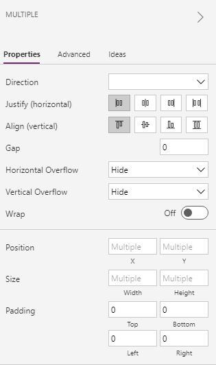
- Direction : It defines the orientation of the container’s child components ” the items inside the container” either Horizontal or Vertical.
- Justify : It defines how child elements are aligned with the primary axis and it will help you to set the position of controls inside your container along the primary axis ( Start, End, Center, Space Between)
- Align: Defines how child components are positioned in the container, in the off axis (opposite from LayoutDirection). Start, Center, End, Stretch
- Gap: It provides the space “distance ” between containers controls in pixels.
- Horizontal and Vertical Overflow: It controls whether the container displays scrollbars or removes content when it becomes too large to fit. So the two properties will define what happens when the contents of the container exceed the size of the container itself.
- Wrap: It defines whether the content wraps to a new row or column when it cannot fit “when the container is smaller than its contents”.
Remove PowerApps container control
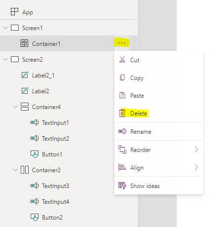
You can also remove a container from your screen and when the container control is removed, the controls inside the container are positioned on the page again.
To remove the container, (…) beside your control and then click on the Remove container as shown in the below image.
What is the difference between group and container in PowerApps?
When using the PowerApps container control for the first time, you might think that this is just the same as grouping with a new name. But a container is more and completely different from the group.
- The group is a concept in Power Apps it used to group a set of controls without affecting the layout of the screen.
- To group some controls, you have to select the controls that you want to put them in a group
- When multiple controls are selected, the existing Ctrl+G keyboard adds the enhanced Group control and moves the controls selected as children.
- Ctrl+G will then ungroup the child controls.
- Groups leave the controls inside a group use positioning relative to the screen.
- The group and ungroup commands are also available from the Home > Group menu. and then type Ctrl+G
- The Container is a control that used to hold some controls inside it
- The Power Apps container control affect the layout of the screen it will wrap all the controls present inside that container.
- The positions of the controls inside the containers are relative to the container rather than the screen.
- You can also release a container. when the container control is removed, the controls inside the container are positioned on the page again.
This is the difference between group and container in PowerApps “PowerApps container vs group”
Converting groups into containers
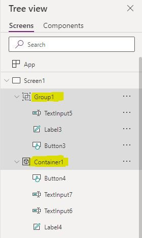
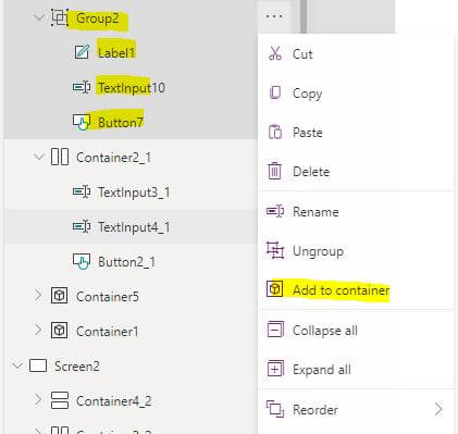
If you want to convert your app groups into containers to simplify your app by using container.
- Select the group you want to convert into containers
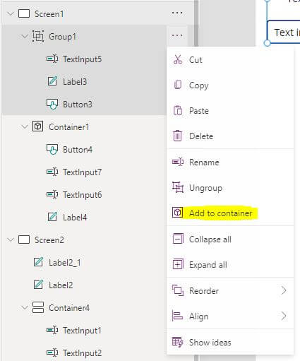
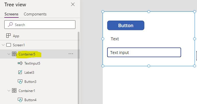
- and then select the Add to container option by clicking the Ellipses “…” beside your group that you want to convert as shown in the bellow image.
- after that your group will be converted into a container and you can take advantage of the container control as shown below in the second image.
PowerApps nested Containers
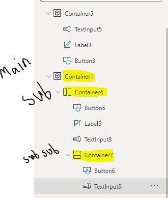
- Once you have created containers you can also create nested containers “Create child container inside the parent container”.
- And all the same relative positioning options are still available inside the nested containers.
- Select your main container and insert the sub containers
Vertical and Horizontal Containers Properties
There are some important properties in the vertical container and the horizontal container such as wrap, Direction, Justify, Gap, and Overflow.
PowerApps Container Direction Property
Using this property you can convert the container from Horizontal to vertical or from vertical to horizontal it will provide you with two option Horizontal and Vertical, the default value will be your container type that you insert and then you can to convert t to the other type.

Container Justify property
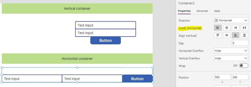
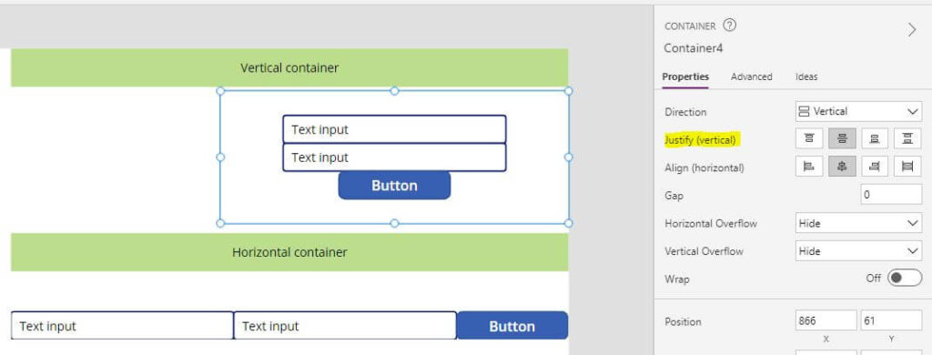
- It defines how child elements are aligned with the primary axis and it will help you to set the position of controls inside your container along the primary axis
- For the horizontal container it will be justify (horizontal)
- For the vertical container it will be justify (vertical )
- It will provide you with four options Start, End, Center, Space Between
- Start, the controls positioned horizontally or vertically to the start of the container
- End, the controls positioned horizontally or vertically to the end of the container
- Center, the controls positioned horizontally or vertically to the center of the container
- and Space Between , put equal spaces between the controls “horizontally or verticallys”
Container Align property
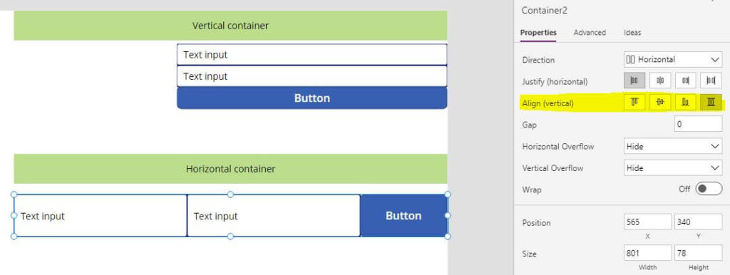
Defines how child components are positioned in the container, in the off axis (opposite from LayoutDirection). it willl provide you with four options
Align “Vertical” for the horizontal container
- Start, the controls positioned vertically at the top of the container
- Center, the controls positioned vertically to the center of the container
- End, the controls positioned vertically at the bottom of the container
- Stretch the controls stretched vertically to fill the height of the container
Align “Horizontal” for the vertical container
Start, the controls positioned vertically at the left of the container
Center, the controls positioned vertically to the center of the container
End, the controls positioned vertically at the right of the container
Stretch the controls stretched vertically to fill the width of the container

PowerApps Container control Gap Property
- It provides the space “distance ” between containers controls in pixels.
- The default value is 0 and in this case, the controls have no space between them.
- If you want to provide space between the controls increase the value of the gap property

PowerApps Container Overflow Property
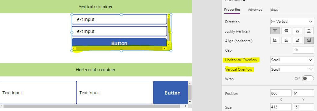
It controls whether the container displays scrollbars or removes content when it becomes too large to fit. there are two to scroll the PowerApps Horizontal and Vertical container Container
- Horizontal Overflow
- Vertical Overflow
And the two properties will define what happens when the contents of the container exceed the size of the container itself.
and there are two sub properties for each one of the two properties “Horizontal Overflow ,Vertical Overflow”.
- Hide, does not show any content beyond the limits of the container.
- Scroll, Provide the container with a scroll “vertically, Horizontally”
PowerApps Container Wrap Property
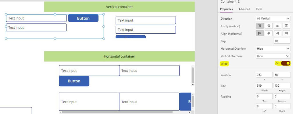
- This property is useful when you want to make a responsive Power Apps canvas app .
- The wrapping container divides the lines in a respective manner,
- Power Apps Horizontal Container Wrap property will position the controls inside the container on the next row when the container is smaller than its contents.
- Power Apps Vertical Container Wrap will position the controls inside the container on the next column when the container is smaller than its contents.
PowerApps container flexible width
This property is only available for horizontal containers. When the flexible width option is disabled, the width of controls will be whatever is specified in the properties. When flexible width is enabled for a single control within a container, the control will take up the remaining space within the container. If the flexible width of multiple controls is set to On, both will occupy the space left equal to the control portion. If a specific control requires a larger portion of the container’s space, you can specify it in the Fill portion property.
PowerApps container flexible Height
This property is only available to vertical containers. It is similar to flexible width but operates vertically. When the flexible height option is disabled, the height of the controls will be whatever is specified in the properties. When flexible width is enabled for a single control within a container, the control will occupy the container’s space. If multiple controls have their flexible width set to On, they will take up the same amount of space in the control. If a specific control requires a larger portion of the container’s space, you can specify it in the Fill portion property.
Container Padding Property
- PaddingTop, specifies the distance between text in a control and the top edge of that control.
- PaddingBottom, specifies the distance between text in a control and the control’s bottom edge.
- PaddingLeft, specifies the distance between text in a control and the control’s left edge.
- PaddingRight, specifies the distance between text in a control and the control’s right edge.
PowerApps container control hide
If you want to hide the container control with all of its child controls you can use the PowerApps container visible property visible property, Once you will disable the container Visible property from the Properties pane, the container will hide otherwise it will appear on your screen.
PowerApps container control auto height
There is no property called Auto height in the PowerApps Container control .you can use the Height property to increase the container height on the app or you can make the height depend on the total sum of the controls height inside that container.
PowerApps container control background image.
If you have a main container with a height and width of the app screen “parent.height and parent.width”,
you can add the image as the background to the screen and making the container transparent.
PowerApps add existing controls to container
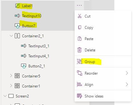
- Select your controls
- Add the selected controls to a group
- Add the group to the container
How to make the PowerApp responsive using containers?
Containers help in placing objects encapsulated by the container responsively, and we can use the previous properties to help us in the responsive app.
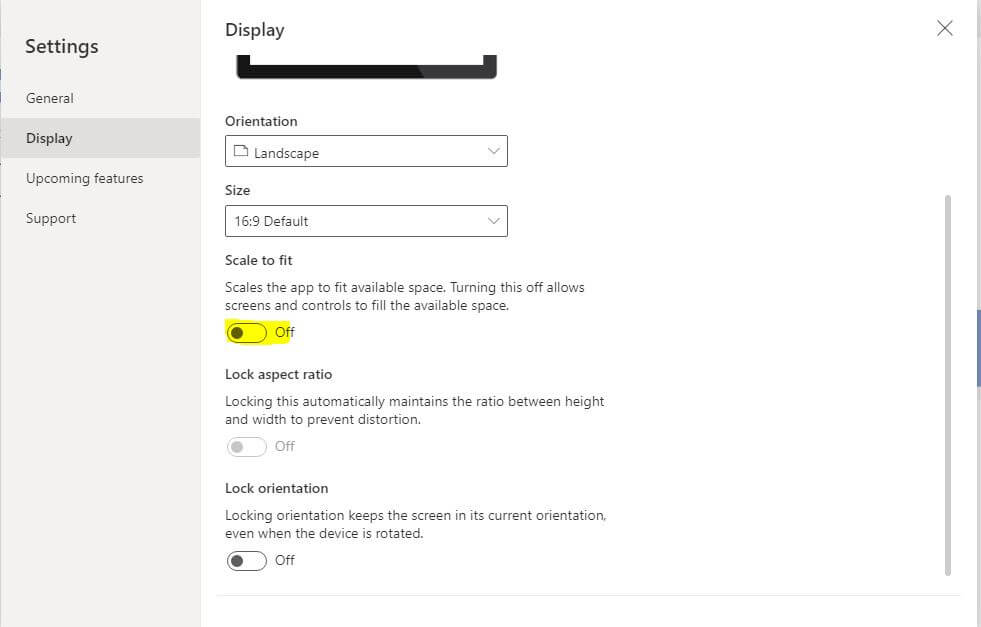
- You activate responsiveness by turning off the app’s Scale to fit setting, which is on by default. When you turn this setting off, you also turn off Lock aspect ratio because you’re no longer designing for a specific screen shape. (You can still specify whether your app supports device rotation.)
- use the container control, as a parent control to design your app layout.
- Set the width and the height of the Containers to be relative to the parent width and height
- Example “Parent.Width” ,“Parent.Height”
- Auto-layout the container controls, To automatically layout the child components, you can use an experimental feature called Auto-layout container controls. Because these containers determine the position of the child components, you never have to set X, Y for a component within the container. It can also distribute available space to its child components based on the settings, and it determines the vertical and horizontal alignment of the child components. Instead of that you can define the responsive Properties of controls inside the container such as:
- Minimum height of the controls
- Minimum width of the controls
- Enable Flexible height for the controls in the vertical container
- Enable Flexible width for the controls in the horizontal container
- With all the properties above, the container’s controls will act responsive.
Conclusion
In this Power Apps post we learn How to use the PowerApps container control and how to apply the different properties to the container and how to create responsive layout using the container control.
See Also
- What are Microsoft Power Apps?
- How To Make PowerApps Work Offline?
- How PowerApps Patch Collection?
- PowerApps Patch Function Uses And Examples
- PowerApps Print Function, Forms, And Scrollable Galleries
- PowerApps Validation Examples On/before Submitting
- Share PowerApps With External Users / Guest Users
Join us
- Subscribe to Power Platform Geeks YouTube channel.
- Register to Saudi Arabia Power Platform User Group.
Need Help
- Have a related question? Please ask it at deBUG.to Community.
